When I started learning web development, I thought building a website was all about making it look attractive. I spent hours choosing colors, fonts, and layouts, only to realize that my website looked great on my laptop but completely broke on my phone. Text became too small, images overflowed, and buttons were almost impossible to tap. That was the moment I truly understood the importance of responsive web design.
Building a responsive website means creating a site that automatically adjusts to different screen sizes, whether someone visits it on a desktop, tablet, or smartphone. Today, this is no longer optional. Most people browse the internet using mobile devices, so every website should provide a smooth experience regardless of the screen size.
In this article, I will share the lessons I learned while building my first responsive website. If you are just getting started, these tips will save you time, reduce frustration, and help you create websites that look professional on every device.
Understanding What Responsive Design Means
Before writing any code, I wanted to understand what responsive design actually was. At first, I assumed it meant creating separate websites for desktop and mobile users. Thankfully, that is not how modern web development works.
A responsive website uses the same HTML content for every visitor while CSS adapts the layout according to the screen size. Instead of creating multiple versions of a website, one flexible layout changes automatically.
Once I understood this concept, everything became much easier. My goal was no longer to design for one screen. Instead, I designed for every screen.
Planning Before Writing Code
One mistake I made early on was jumping straight into coding without a plan. I would create random sections, then spend hours rearranging them later.
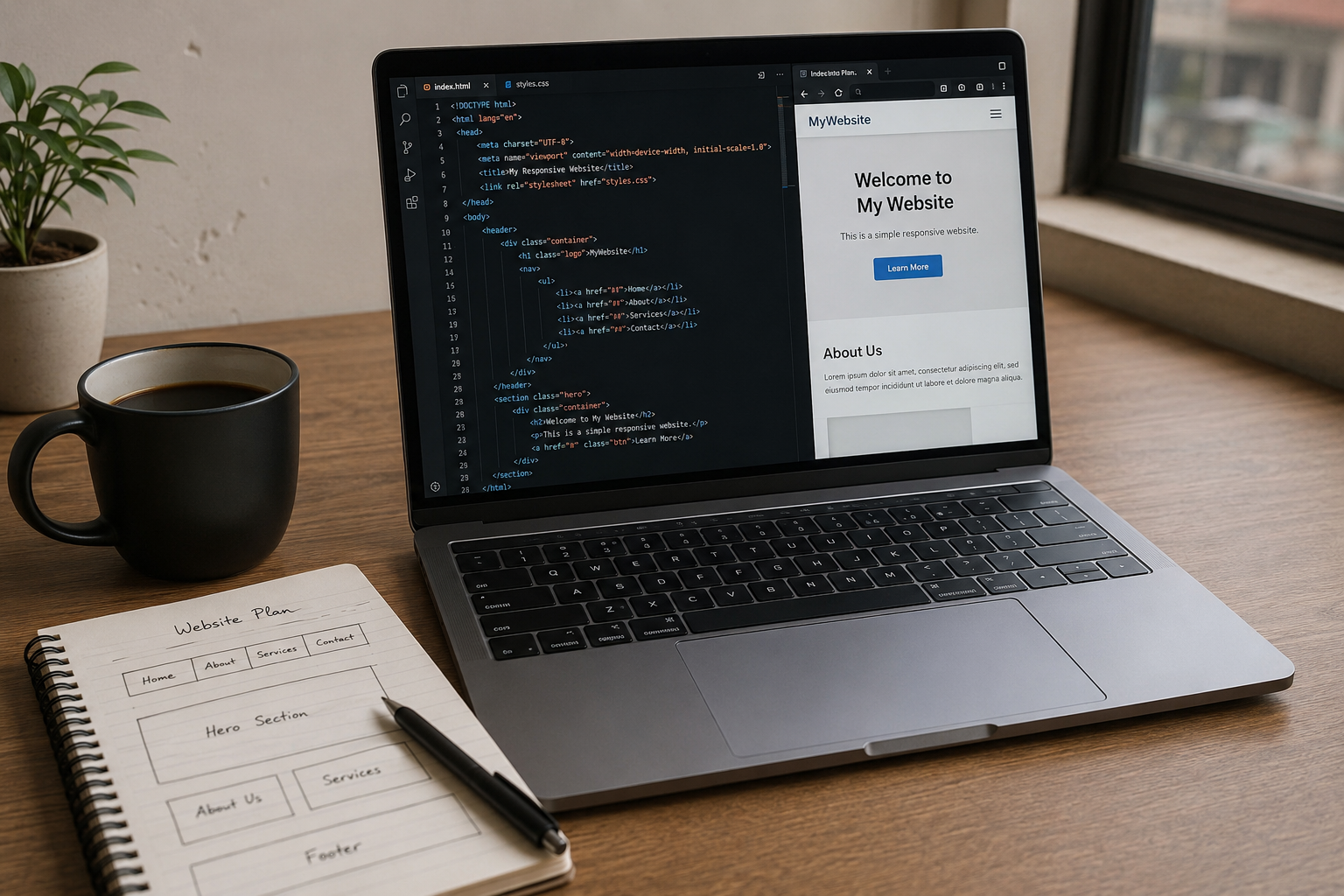
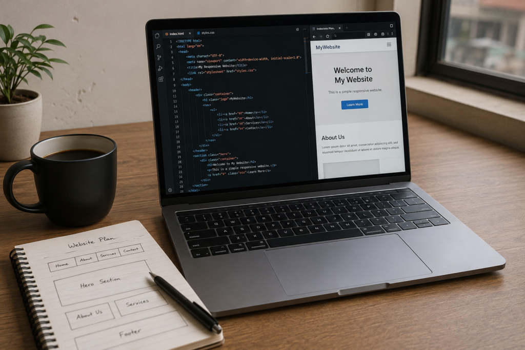
Now I always start with a simple sketch. It does not have to be beautiful. Even drawing boxes on paper helps me organize the layout.
For my first responsive website, I planned these sections.
Home
About
Services
Portfolio
Contact
Having this structure before coding made the entire project much smoother.
Creating the Basic HTML Structure
HTML provides the foundation of every website. I always begin by creating clean and organized markup before thinking about design.
A simple structure includes:
Header
Navigation menu
Hero section
Content sections
Footer
Using proper HTML elements makes the website easier to understand for browsers, search engines, and other developers.
Keeping HTML organized also makes responsive styling much easier later.
Adding the Viewport Meta Tag
One small line of code completely changed how my website appeared on mobile devices.
The viewport meta tag tells browsers to match the page width to the device screen.
Without it, mobile browsers often display desktop layouts that appear tiny and difficult to read.
I learned this lesson after wondering why my carefully designed page looked terrible on my phone.
Now I never forget to include the viewport setting.
Styling with CSS
After creating the HTML structure, I started adding styles with CSS.
At first, I focused on keeping the design simple.
I chose one primary color.
I selected readable fonts.
I used consistent spacing.
I avoided unnecessary animations.
Simple designs often look cleaner and load faster than complicated ones.
Instead of trying to copy large company websites, I focused on creating something neat and functional.
Using Flexible Layouts
The biggest improvement came when I stopped using fixed widths.
Originally I gave containers widths like 1200 pixels.
Everything looked fine on my monitor but terrible on smaller screens.
Later I discovered percentage based widths and flexible containers.
Instead of forcing elements into fixed sizes, they naturally adjusted according to available space.
This single change made my website much more adaptable.
Learning Flexbox
Flexbox completely changed how I build layouts.
Before learning Flexbox, I struggled with positioning items evenly.
Sometimes content aligned correctly.
Other times everything shifted unpredictably.
Flexbox solved most of those problems.
I used it for navigation bars.
Feature sections.
Card layouts.
Buttons.
Image galleries.
Its ability to align and distribute content automatically saved me countless hours.
For beginners, Flexbox is one of the most valuable CSS skills to learn.
Using CSS Grid
After becoming comfortable with Flexbox, I started exploring CSS Grid.
Grid made it easier to create more advanced layouts with rows and columns.
For example, my portfolio section displayed three project cards on desktop.
On tablets it displayed two cards.
On mobile it displayed one card.
The layout adjusted without needing separate HTML.
That flexibility made the website feel modern and professional.
Making Images Responsive
One issue I repeatedly faced involved oversized images.
Large images often stretched outside containers or forced horizontal scrolling.
The solution was surprisingly simple.
Images should be allowed to scale according to their parent container instead of keeping fixed dimensions.
Once I made images flexible, they automatically adjusted to different screen sizes while maintaining quality.
Now every image on my websites behaves consistently.
Using Relative Units
Early in my learning journey, I relied heavily on pixels.
Everything had fixed values.
Text sizes.
Margins.
Padding.
Container widths.
Over time I realized that relative units provide much greater flexibility.
Units like percentages, rem, and em allow layouts and typography to adapt naturally across different devices.
This approach creates a more consistent experience for users.
Creating Responsive Typography
Readable text is one of the most important parts of a good website.
I used to make headings extremely large because they looked impressive on my desktop.
Unfortunately, those same headings filled almost the entire phone screen.
Now I scale typography according to screen size.
Large displays receive bigger headings.
Small devices receive more compact text.
This keeps content comfortable to read everywhere.
Building a Mobile Friendly Navigation
Navigation became one of my biggest challenges.
Desktop menus looked perfect with several links displayed horizontally.
On smaller screens, those links quickly ran out of space.
The solution was simplifying the menu.
Some developers use hamburger menus.
Others stack links vertically.
For my first responsive website, I kept the navigation simple and easy to tap.
The easier visitors can move around your website, the better their overall experience.
Using Media Queries
Media queries are what truly make responsive websites possible.
They allow CSS styles to change depending on screen width.
For example, a three column layout on desktop can become two columns on tablets and one column on smartphones.
I remember feeling amazed the first time I resized my browser window and watched the layout adjust automatically.
It felt like my website had become alive.
Media queries gave me complete control over how every section behaved on different devices.
Paying Attention to Spacing
Spacing is something beginners often overlook.
At first, I packed everything tightly together because I wanted more content on the page.
The result looked crowded and difficult to read.
Later I realized that white space improves readability dramatically.
Giving sections breathing room makes a website appear cleaner and more professional.
Now I spend almost as much time adjusting spacing as I do choosing colors.
Keeping Buttons Easy to Tap
Desktop users click with a mouse.
Mobile users tap with their fingers.
That difference matters.
Small buttons may look fine on a computer but become frustrating on phones.
I increased button size, added padding, and left enough space between clickable elements.
This simple improvement made the website much more comfortable to use.
Testing on Different Devices
One lesson I learned quickly is that browser previews are helpful but not enough.
Whenever possible, I tested my website on:
Desktop computer
Laptop
Tablet
Android phone
iPhone
Different browsers also display websites slightly differently.
Checking Chrome, Firefox, Edge, and Safari helped me identify small layout issues before publishing.
Testing takes time, but it prevents visitors from encountering unexpected problems.
Optimizing Website Performance
A responsive website should also load quickly.
Large image files, unnecessary animations, and excessive code can slow everything down.
I started compressing images before uploading them.
I removed unused CSS.
I minimized unnecessary JavaScript.
These small improvements noticeably reduced loading time.
Fast websites provide a better user experience and often perform better in search engines.
Keeping the Design Consistent
Consistency makes websites feel trustworthy.
I use the same fonts throughout the site.
Buttons follow one design style.
Colors remain consistent.
Spacing follows predictable patterns.
This creates a polished appearance even if the website itself is relatively simple.
Visitors appreciate designs that feel organized and familiar.
Learning Through Small Projects
One mistake I made was trying to build a massive website immediately.
It became overwhelming.
Instead, I started creating small practice projects.
Landing pages.
Personal portfolios.
Simple business websites.
Each project taught me something new.
Over time, my confidence improved naturally.
Building several small websites is often more valuable than struggling with one giant project.
Common Beginner Mistakes
Looking back, I made many mistakes during my first responsive website project.
I ignored mobile testing.
I used fixed widths everywhere.
I chose fonts that were too small.
I uploaded oversized images.
I added unnecessary visual effects.
I skipped planning.
Although these mistakes slowed my progress, they also became valuable learning experiences.
Every developer improves by solving real problems.
Why Responsive Design Matters More Than Ever
Today people browse websites from almost every type of device imaginable.
Phones.
Tablets.
Laptops.
Desktop computers.
Large monitors.
Even televisions.
A responsive website ensures every visitor enjoys a pleasant experience regardless of screen size.
Businesses also benefit because visitors stay longer and are more likely to interact with the content.
For developers, responsive design is now an essential skill rather than an optional feature.
My Advice for Beginners
If you are building your first responsive website, do not aim for perfection.
Focus on learning one concept at a time.
Understand HTML first.
Practice CSS daily.
Learn Flexbox.
Then explore CSS Grid.
Experiment with media queries.
Test your website often.
Most importantly, keep building.
Every project teaches lessons that no tutorial can fully explain.
Conclusion
Building my first responsive website was both exciting and challenging. There were moments when layouts refused to cooperate, images stretched unexpectedly, and menus looked completely different on every device. Instead of giving up, I treated each problem as an opportunity to learn.
Over time, I realized that responsive web design is not about memorizing complicated techniques. It is about creating flexible layouts, writing clean code, testing regularly, and always thinking about the people who will use the website.
If you are just beginning your web development journey, remember that every experienced developer once built their first responsive website too. Start with simple projects, practice consistently, and keep improving one step at a time. With patience and regular practice, you will soon be creating professional websites that look great on every screen and provide an excellent experience for every visitor.